A Tableau Alternative in Python for Data Analysis (in Streamlit & Jupyter) | PyGWalker Tutorial
Summary
TLDR本视频介绍了一个名为PyGWalker的Python库,它允许用户将Pandas数据框转换为类似Tableau的用户界面,以进行直观的数据分析。通过简单的安装和导入,用户可以在Jupyter Notebook或Streamlit应用中使用它。视频展示了如何加载数据集、探索数据、创建和自定义图表、应用过滤器以及导出图表和代码。此外,还演示了如何将PyGWalker集成到Streamlit应用中,提供了一个交互式的数据分析体验。
Takeaways
- 📦 安装PyGWalker库:通过运行命令 'pip install pygwalker' 来安装。
- 📈 导入库和数据集:在Jupyter Notebook或Streamlit应用中导入PyGWalker和pandas库,并加载示例数据集'tips'。
- 🔍 数据探索:使用 'pyg.walk' 函数将Pandas数据框转换为可视化界面,探索数据。
- 🎨 主题模式选择:可以选择使用亮色或暗色模式进行数据可视化。
- 📊 数据标签和分类:PyGWalker自动将数值标记为度量(measures),其他列为维度(dimensions)。
- 🖱️ 拖放可视化:可以拖放字段到x轴和y轴进行图表创建,如按天数展示总账单金额。
- 🔄 图表类型切换:默认情况下PyGWalker选择图表类型,但也可以选择其他类型,如折线图。
- 🔍 数据筛选:通过拖放字段到过滤器区域,可以筛选特定数据,如仅显示男性顾客的数据。
- 🖼️ 图表导出:支持将图表导出为可缩放矢量图形(SVG)等格式。
- 📑 代码和配置导出:可以导出创建的仪表板代码或配置文件,方便复用和分享。
- 🛠️ Streamlit集成:将PyGWalker仪表板集成到Streamlit应用中,提供交互式数据分析体验。
Q & A
PyGWalker是什么?
-PyGWalker是一个Python库,它允许用户将Pandas数据框转换成类似Tableau的界面,用于可视化分析。
如何安装PyGWalker?
-在命令提示符或终端中运行'pip install pygwalker'即可完成安装。
PyGWalker可以集成到哪些应用中?
-PyGWalker可以集成到Jupyter Notebook或Streamlit应用中。
演示中使用了哪个数据集?
-演示中使用了名为'tips'的数据集,包含了账单总额、小费、性别、是否吸烟、访问日期和时间以及人数等信息。
使用PyGWalker如何探索数据集?
-通过调用'pyg.walk'函数并传入数据框来探索数据集,用户还可以选择使用深色或浅色模式。
PyGWalker如何自动标记数值?
-PyGWalker会自动将数值标记为度量(measures),其余的标记为维度(dimensions)。
在PyGWalker中如何创建图表?
-用户可以通过拖放字段到x轴和y轴来创建图表,PyGWalker默认会为用户选择图表类型,但也可以选择其他类型的图表。
如何在PyGWalker中过滤数据?
-通过将列拖入过滤器字段来应用过滤,可以选择特定的值进行过滤,也可以移除过滤器来恢复数据。
PyGWalker支持哪些图表导出格式?
-PyGWalker支持将图表导出为可缩放矢量图形(SVG)格式。
如何将PyGWalker集成到Streamlit应用中?
-通过读取配置文件并在Streamlit应用中使用'pyg.walk'函数,指定环境为'Streamlit',即可集成PyGWalker。
PyGWalker的导出功能有哪些用途?
-用户可以导出图表、代码或配置文件,以便在其他环境中复现或分享分析结果。
如何获取演示中提到的Streamlit应用和Jupyter Notebook?
-这些资源将被上传到演讲者的GitHub仓库中,链接会在视频描述框中提供。
Outlines
🚀 介绍PyGWalker库
本段介绍了一个新的Python库PyGWalker,它允许用户将Pandas数据框转换成类似Tableau的用户界面,用于可视化分析。首先,用户需要通过命令提示符或终端安装PyGWalker库。安装后,可以与pandas一起导入。为了演示,加载了一个名为'tips'的数据集,并展示了数据集的内容。接着,通过调用'pyg.walk'函数并传入数据框,即可开始探索数据集。用户可以选择使用深色或浅色模式。执行后,用户将看到一个带有两标签页的画布。在数据标签页中,可以检查数据框和条目。PyGWalker会自动将数值标记为度量,其余标记为维度。在可视化标签页中,用户可以像在Tableau中一样,通过拖放字段到x轴和y轴来创建图表。默认情况下,PyGWalker会为用户选择图表类型,但用户也可以选择其他类型的图表。此外,用户可以通过拖放额外字段到y轴来探索数据,例如将小费添加到y轴,并查看平均账单金额。如果需要移除字段,只需将其拖回字段列表即可。同样,用户可以向x轴添加多个字段。为了探索吸烟者是否花费更多,并查看每天的午餐和晚餐时间的情况,可以使用颜色字段进行过滤。最后,介绍了如何导出图表,并展示了如何将PyGWalker集成到Jupyter Notebook和Streamlit应用程序中。
Mindmap
Keywords
💡PyGWalker
💡Pandas
💡Jupyter Notebook
💡Streamlit
💡数据集
💡可视化
💡拖放界面
💡过滤器
💡图表类型
💡导出
💡配置文件
💡探索性数据分析
Highlights
介绍了一个名为PyGWalker的新型Python库,可以将Pandas数据框转换为类似Tableau的用户界面,用于可视化分析。
PyGWalker可以集成到Jupyter Notebook或Streamlit应用程序中。
安装PyGWalker只需在命令提示符或终端中运行'pip install pygwalker'。
导入PyGWalker和pandas库后,可使用'pyg.walk'函数探索数据集。
PyGWalker提供了暗模式和亮模式的选项。
PyGWalker自动将数值标记为度量,其余标记为维度。
用户可以通过拖放字段到x轴和y轴来创建图表,类似于Tableau。
PyGWalker默认为数据选择图表类型,但也支持其他图表类型,如折线图。
可以通过拖放额外字段到y轴来探索数据,例如添加小费到总账单金额的图表中。
可以通过拖放字段到字段列表中来移除字段。
可以使用颜色字段来应用过滤器,例如只显示男性顾客的数据。
PyGWalker是一个快速探索性数据分析的有趣工具。
支持导出图表为可缩放矢量图形(SVG)格式。
在Jupyter Notebook中可以添加额外的图表画布来进一步探索数据。
PyGWalker允许导出代码,方便用户复制和粘贴到新的单元格中。
可以导出设置为文件,如'config.json',以便在Streamlit应用中使用。
展示了如何在Streamlit应用中实现PyGWalker仪表板。
上传了Streamlit应用和Jupyter Notebook到GitHub仓库,链接在视频描述中提供。
Transcripts
Hey guys, There's a new Python library called PyGWalker,
which lets you turn your Pandas dataframe into a Tableau-style User Interface for visual
analysis.
You can integrate it into your Jupyter Notebook or Streamlit app.
Let me show you how to use it.
First things first, you need to install it.
Just run "pip install pygwalker" in your command prompt or terminal, and you're all set.
Once that's done, you can import it together with pandas.
Next, for demo purposes, let's load the 'tips' dataset, which looks like this.
Here, we can see the total bill amount, along with the tips, gender, whether the customer
was a smoker or not, the day and time of the visit, and the size.
Alright, now let's assume you want to explore this dataset.
Instead of plotting it in different ways, you can simply call "pyg.walk" and pass in
your dataframe.
You could also specify if you want to use a dark or light mode.
After executing this line, you'll get this canvas with two tabs.
Let me first switch to the data tab.
Here, you can inspect your dataframe and check out some entries if you'd like.
You'll also notice that PyGWalker automatically labels the numeric values as measures and
the rest as dimensions.
Now, let's switch back to the visualization tab.
Like in Tableau, you can now drag and drop the available fields into the x and y axes.
So, for example, let me plot the total bill amount by day.
To resize the graph, you can click here and choose the fixed layout mode.
Now you can resize the chart.
By default, PyGWalker picks a chart type for you.
However, you can use other chart types, like a line chart.
But for our analysis, I'll switch back to the bar chart.
The cool thing is, you can drag additional fields into your chart to explore your data
in a very intuitive way.
So, for example, I'll add the tips to the y-axis.
And instead of the total sum, I might want to look at the average bill amount.
If you want to remove a field, you can simply drag it back to the field list.
Likewise, you can add multiple fields to the x-axis.
Let's say, I'm interested to see if smokers spend more money, and I want to see it for
each day.
Additionally, I also want the information if it was during dinner or lunchtime.
To do that, you can use the colour field.
And I'm only interested in this result for male customers.
So you can apply a filter by dragging the column into the filter field.
Now, I'll select only 'male' and confirm my selection.
The values will then be filtered accordingly.
And to remove it, you can either select all again or simply drag it out of the filter
field.
I think it's a very interesting tool for quick exploratory data analysis.
However, you can also export the charts.
So, for example, I'll export it to a scalable vector graphic, and this is what it looks
like.
Alright, now back in my Jupyter Notebook, you can add additional charts by clicking
up here.
And now you have a second canvas, where you can again explore your data.
There are actually a couple more options in PyGWalker, but I would encourage you to play
around with it yourself.
But one important feature is to export your code.
So, if you click the "Export As" button, you'll have different options.
First, let me export it as "code".
Next, I'll hit the 'Copy to Clipboard' button.
Now, if I paste it into a new cell, you'll see the spec of my dashboard.
If I run "pyg.walk" and specify my specs, we'll get back the same dashboard.
Alternatively, you could also export your settings as a file.
If you do so, you'll get a "config.json".
Let me grab this config file from my downloads folder and paste it into my current directory.
Now, if you want, you can also implement the PyGWalker dashboard into your Streamlit app.
To demonstrate this, I've created the following app.
After importing Streamlit, I'll set some basic page configurations.
Next, I'll load our 'tips' dataset and set up a title and subheader.
The interesting part is here.
We can now read the content from the config file and use "pyg.walk" again in our Streamlit
app, together with the previous settings.
All you need to do is specify "Streamlit" in the environment.
This time, I'll also switch it to the dark mode.
Ok, and with that in place, let's spin up my app by running "streamlit run app.py".
Once my page is loaded, we'll have the PyGWalker canvas in our Streamlit app.
And as before, you can now play around with your data directly in Streamlit.
Ok, guys, and that's all I have for you today.
I will upload this Streamlit app and also the Jupyter Notebook to my GitHub repo.
You will find the link in the description box of this video.
As always, thanks for watching, and I'll see you in the next video!
5.0 / 5 (0 votes)

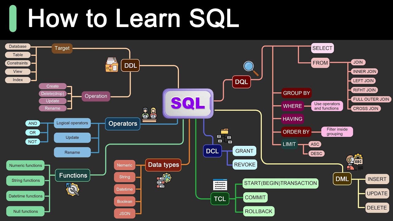
Roadmap for Learning SQL
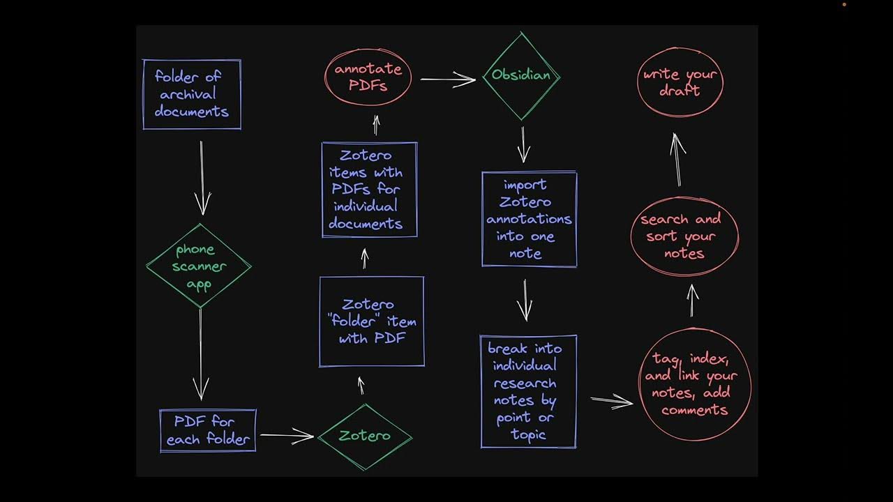
Doing History with Zotero and Obsidian: Archival Research

Risk-Based Alerting (RBA) for Splunk Enterprise Security Explained—Bite-Size Webinar Series (Part 3)
Splunk Field Extraction Walkthrough

Upgrade Your REPORT DESIGN in Power BI | Complete Walkthrough From A to Z
Angular Material Tutorial - 31 - Data table Pagination